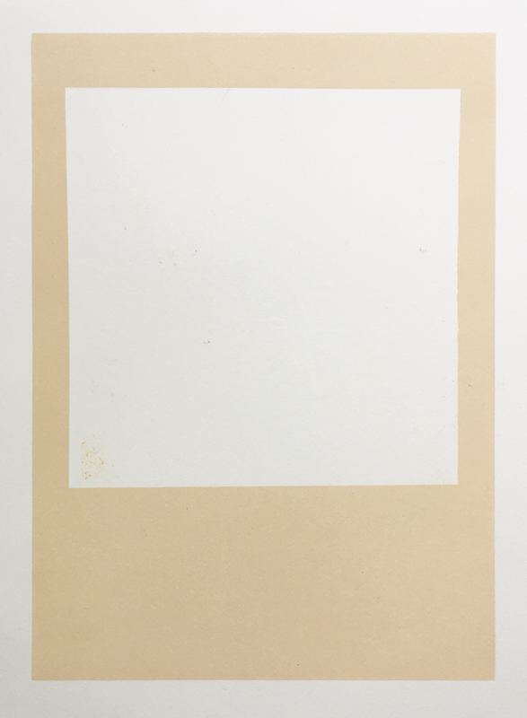
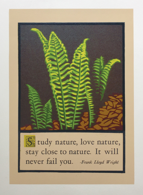
For this print, I wanted to create a more muted margin, to help the ferns really pop. So I first did a rectangular carving with a window in it, and printed beige.
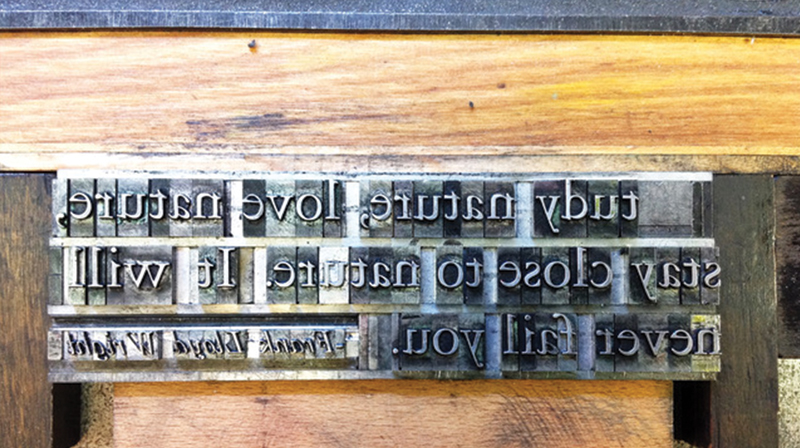
Next I learned a new skill: hand-setting antique metal type! It’s got to be done backwards, of course, with teensy spacers, to make it look right (see detail below).
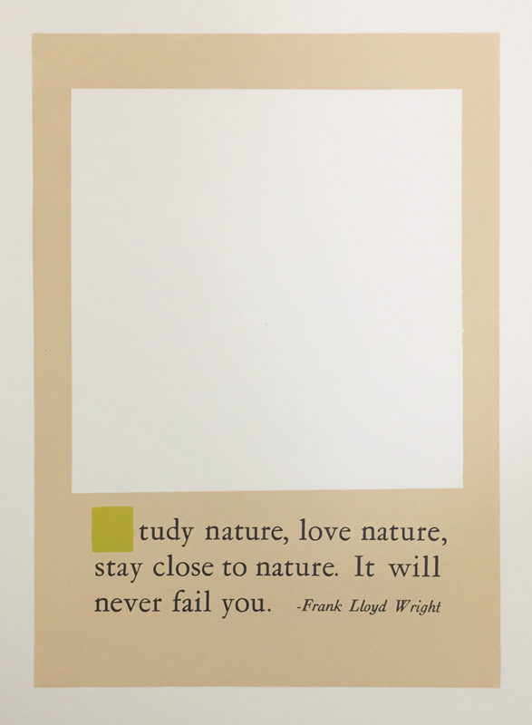
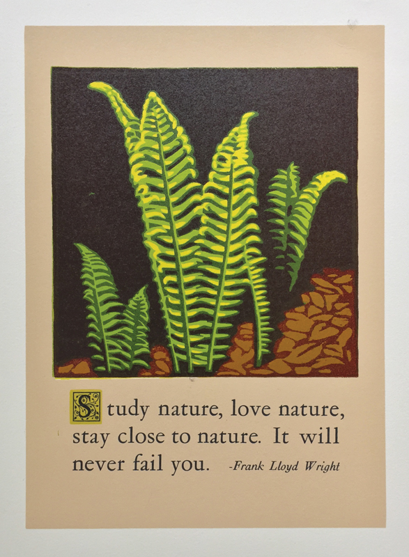
To give the type an old-fashioned element, I printed a green square where the fancy initial cap “S” would go later.
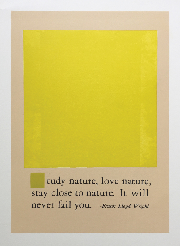
Instead of my usual linoleum, I decided to use wood for the reduction printing of the ferns picture. First, ink the wood with yellow and print.
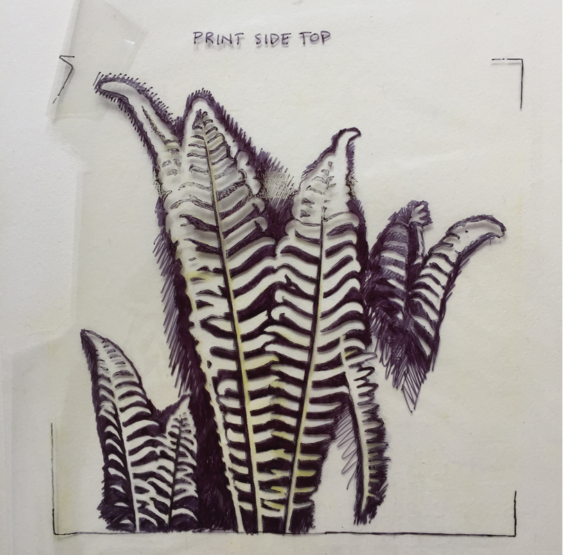
Then I did a very detailed sharpie drawing of the ferns on clear acetate, to use as a carving guide.
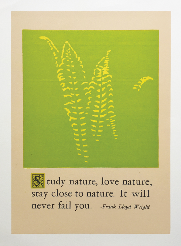
Using the same piece of wood, I carve away the shapes that should stay yellow and print light green. I also did a black printing of my fancy “S.”
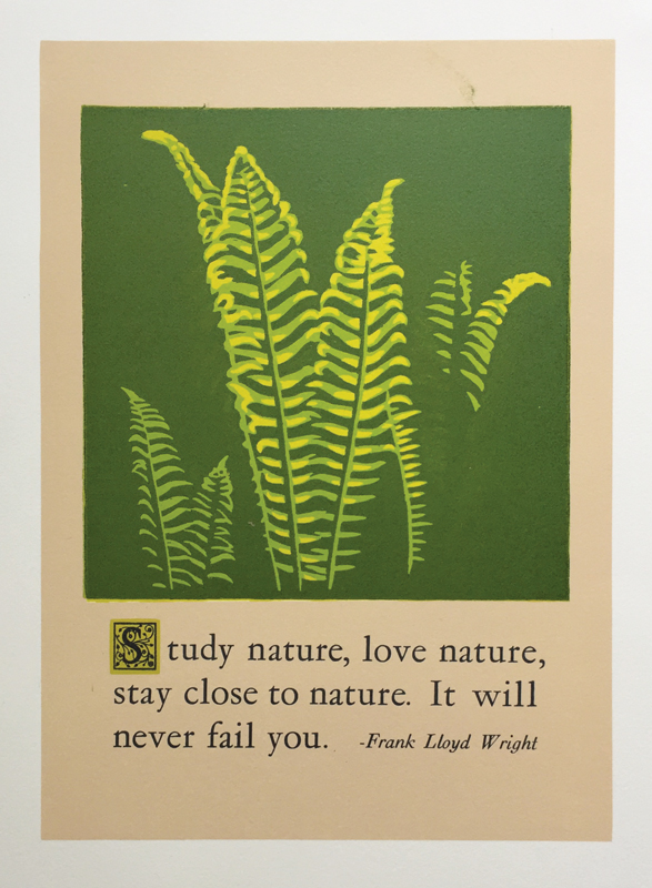
Next, I take the wood and carve away the
shapes that should stay light green, and print darker green.
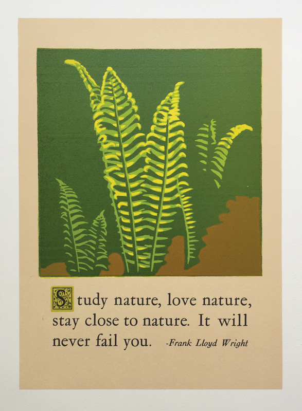
Now I carve a new piece of wood, and print the tan forest floor.
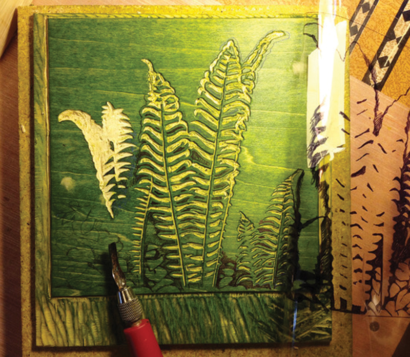
Back to the ferns carving: starting to remove all but the parts that should print dark brown.
Last, take a new piece of linoleum and carve just the black borders, and print.
This is gorgeous in its simplicity. Thank you for showing the process!