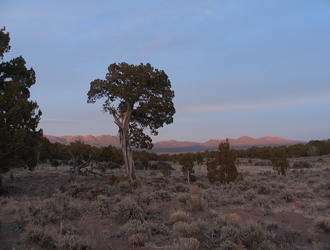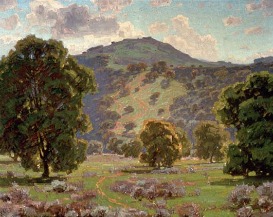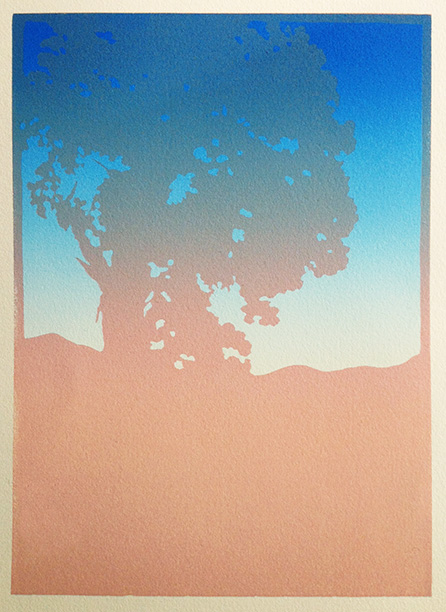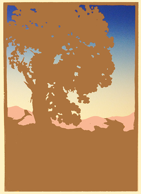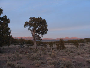
One day last summer while stalking our kids on Facebook, and I see a beautiful photo posted by my friend Robert Shear, of sunset from his back yard in Utah. It’s a scrubby desert landscape, a lone tree, and distant mountains. The photo has little in common with my own photos that have led to block prints–no dappled sunlight, no lush greenery–except that it has a tree: “the broccoli tree,” as Robert calls it. We don’t have broccoli trees here in the Northeast. It’s wonderfully rounded, and reminiscent of the trees you see in California Impressionist landscape paintings, like this:
But the thing that really gets me is the light on those mountains. It’s a warm peachy light, with sort of violet shadows. I think I could make a beautiful print of this! Robert enthusiastically grants me the use of his photo.
There’s one other thing that makes this project special to me, and that’s the back story of Robert, and his extraordinary desert dwelling. We became friends when Robert was a student in one of my block printing workshops. During the workshop, he made a block print of his earthship, which spawned a conversation over the lunch break. Here’s the short version:
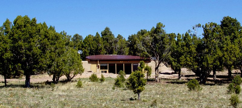
Originally from nearby Buffalo, NY, Robert found his way to the Roycroft Inn in the early 1970s, and there began his gradual absorption into the Arts & Crafts world. In the ’90s, he lived in Manlius, NY, where his wife bought him a Roycroft-designed Little Journeys table at the L & JG Stickley factory. From Manlius he moved to Pasadena, CA, visited the Gamble House, and soon began work on the unique earthship-style mountain cabin, furnished with period pieces and Stickley reproductions, that is now his home. His cabin “The Half Moon,” is built with special features that make it livable and sustainable at low cost in its very remote, off-the-grid location.
Of course I eat this up. A peaceful, minimalist dwelling, beautifully efficient, sustainable and integrated with its natural surroundings? Simple, green living, surrounded only by the useful and beautiful. Heaven! So William Morris, Thoreau, Frank Lloyd Wright… Read the fascinating story of The Half Moon here.
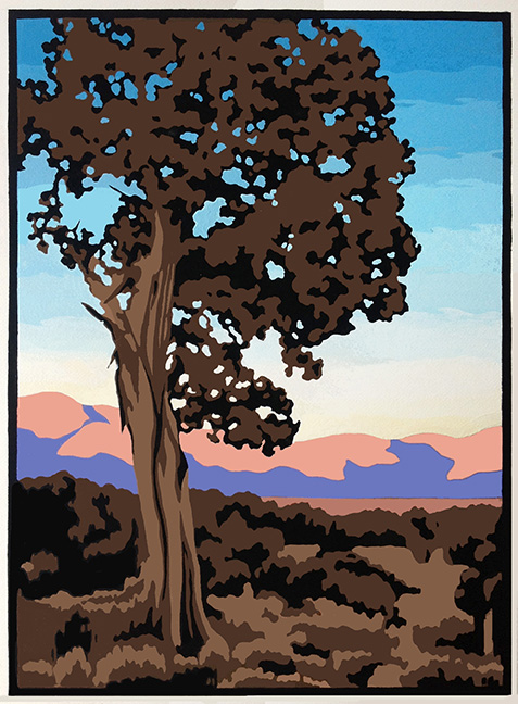
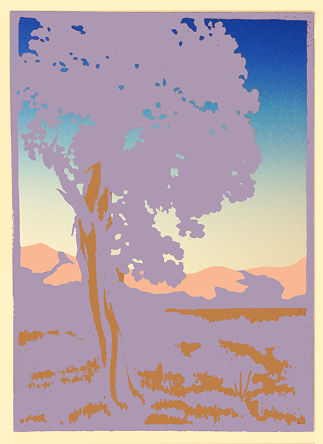
I crop the photo and create a sketch, taking some artistic license, with just five colors plus a fading blue sky. I’m anxious to start printing, but Business Manager Bob urges me to do a painting first, to work out any design bugs before committing them to linoleum. Yes sir, coach. I do a painting in gouache as a study for the print. Gouache isn’t like oils, where you can easily blend colors to create soft gradations, so the sky is bands of color.

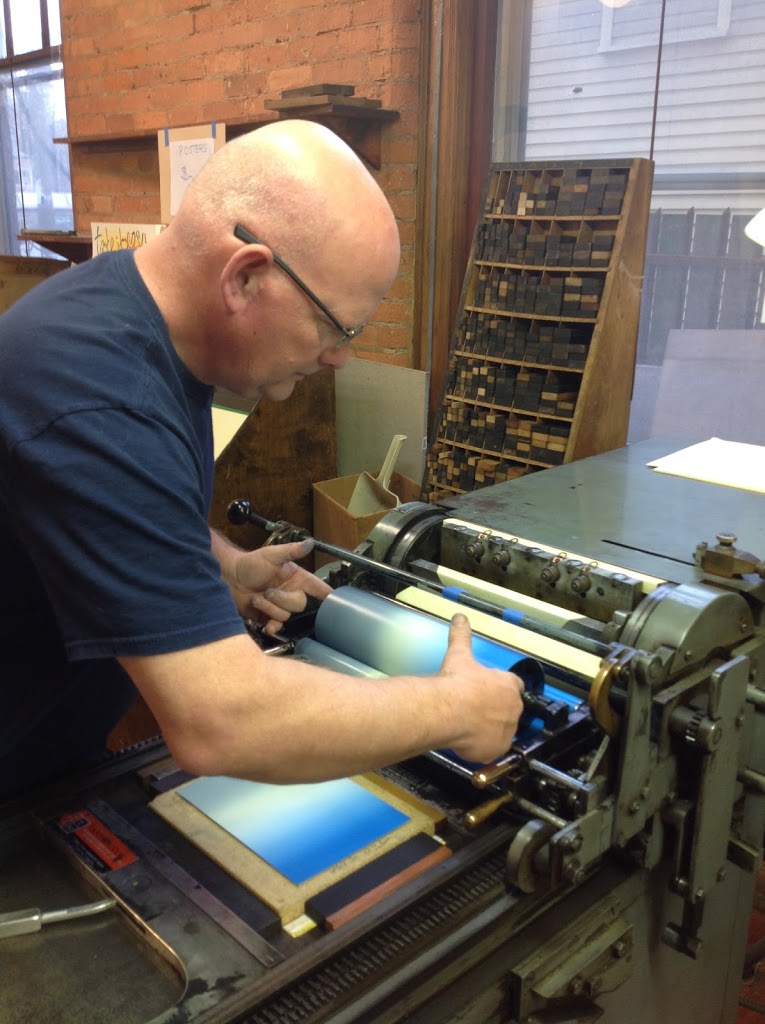
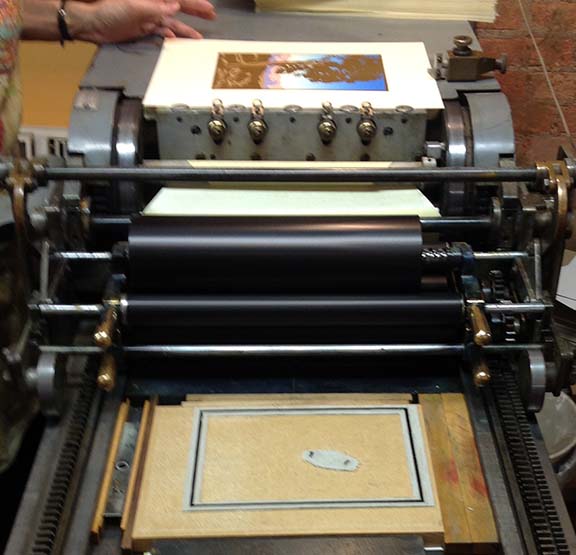
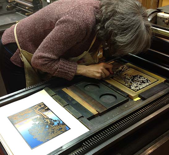
Then, mounted linoleum block (solid, no carving yet) in tow, it’s off to the printing studio. Former pressman Bob locks the block in place on the press. He has already cut 200 sheets of paper to size. I mix up a great blue and a pale yellow, and lay them near the press, along with white, to print the sky.
The sky will be created by a rainbow roll (blending one color into the next on the ink roller). Put a blob of each color on the press roller, spaced carefully, and turn the rollers on. The inks start to spread out and blend with each other as the rollers spin. Bob shows me how to guide the roller sideways back and forth to complete the blending.
With a little trial and error, we’ve got the colors blending so they hit the block at just the right spots. Make a few prints, add blobs of ink (just in the right spots, to keep the blending right), make a few more prints, add ink, until 200 sheets are printed.
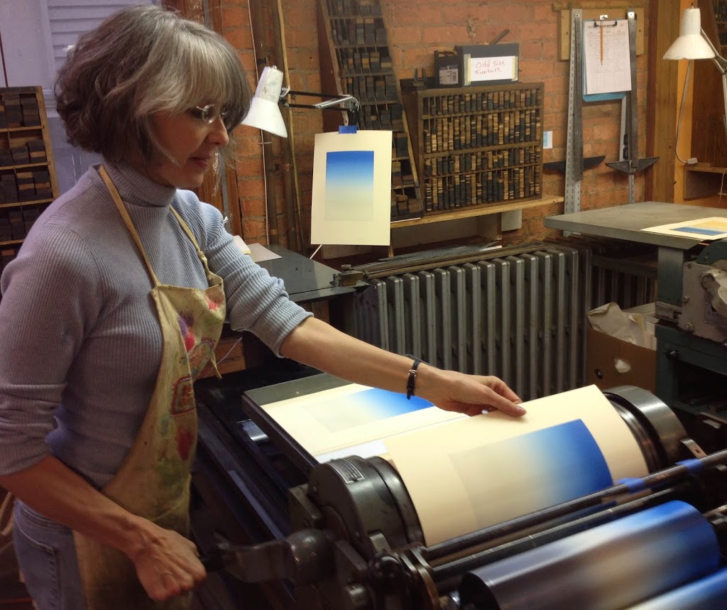
Pulling prints…they look amazing! I love rainbow rolls!
There’s a subtle pale yellow about 2/3 of the way down that I hope will still be visible after the horizon mountains are printed. But with block printing, you’re never exactly sure how things will turn out. Now must break for a show this weekend (the weekend before Thanksgiving).
The following week, I take the same block used to print the sky, and carve away all the sky area (this can be done on a coffee table laden with goodies while visiting with relatives during Thanksgiving family reunion). Relatives approve of broccoli tree image.
Return home, get to printing center. Mix up a fleshy color for the mountains using opaque white, transparent white, yellow, and two reds. Pressman Bob sets the block on the press and stands by with whip and camera. “Print, Chicken, print!”
Stage 2 finished. I think the color looks good, but reserving judgement til all other colors have been printed. When it’s too late to change. Part of the adventure of reduction printing…
Then carve away all parts that should stay pink (mountains) and print tan.
Now carve away all shapes that should stay tan…
…and get ready to print lavender.
Hm. Probably would’ve made more sense to print lavender before tan, but with lots of opaque white ink mixed in, it ought to cover the tan.
Except we want these prints to be done and dry in two days, in order to have them at the Roycroft Winterfest. Normally colors with opaque white in them take many days to dry.
(Those of you who have read the making of “Autumn Hills” are no doubt shaking your heads at this point, remembering my vow to never again rush the making of a print. Don’t worry; I am not sleep deprived or hygiene-deficient, I just want to rush the drying of the ink.)
We are printing at the
Genesee Printing and Bookarts Center, whose cabinets are stocked with all sorts of inks, modern to prehistoric, and related paraphernalia. Bob delves deep into back of a cabinet and finds a can of ink drier from perhaps the 1960s, still more or less in liquid form. What the hell, let’s try it. We mix a couple of drops into the ink.
The ancient drier worked! Lavender ink is dry the next day. Next is brown. It goes amazingly quickly, like only about an hour of printing. I carry stacks of fresh prints to the flat file storage drawer, where I discover half the edition way back in the drawer, unprinted. Sound the alarm to Bob, who has diligently cleaned all the ink off the press. Put block back on press, re-ink, haul out the lavender prints from hiding, and print brown. Both of us shuddering with visions of “what if?” (we didn’t discover those prints until the block had been carved for the next printing?) Eep.
OK. One more color to go: black. There are a couple of things bugging me in this image, so I may have to do two carvings and two black printings. Dang. The left edge of the block is not printing solidly, and there are some little pointy details in the tree that I HATE. (I post this sentiment on FB, and Robert posts Hey, easy on the hating there.)
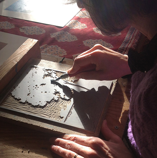
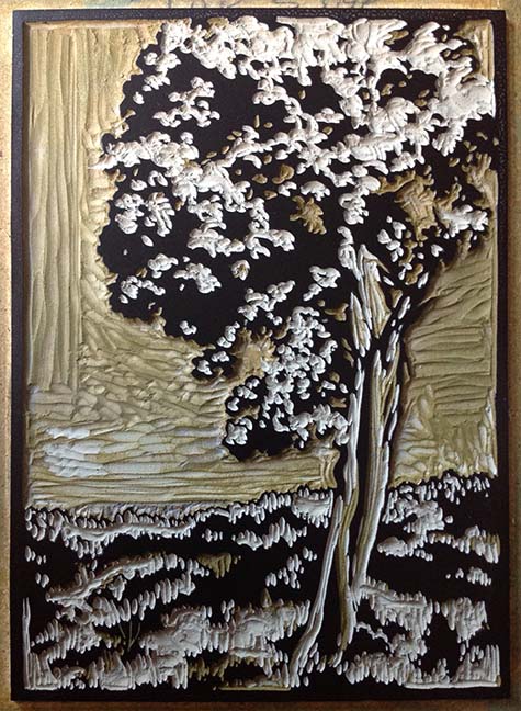
After brown is printed, I color in all the areas on the block that I want to print black. It gets a big confusing because this is all a mirror image. Now I carve away all but the black parts, chanting to myself, “remove the light parts, leave the dark parts.”
And do what we always hope to avoid in a reduction print: carve a separate block, to compensate for something missing in the original block. Carve an outside border, and two dinky little rounded shapes, to cover up those dang pointy things. And print that block first.
Ahhh. No more pointies. And left border looks good.
Now the final printing of the original block. Run a few prints, notice some little raised areas that are catching ink and printing little dots. Dots have no business being there. It’s almost midnight, but I want these prints done for the show.
The block after pesky dots and doohickeys removed (but if you look closely you can see the pointy things, now covered with the first black block).
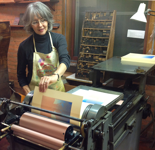
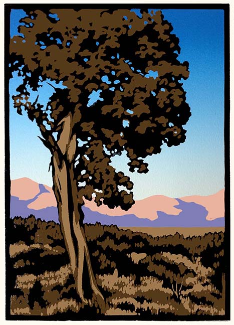
Finished! Wow. In the end, we have 150 perfect prints, plus some artist’s proofs. A satisfying percentage of the original stack. To see “High Desert Juniper” in my online store,
click here.
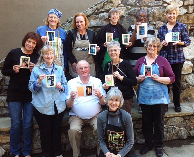
Sending #1 and 2 to Robert Shear as a “thank you” for providing inspiration. Here he is with his broccoli tree. Thanks, Robert!
As a result of the success of this project, I’m now working on new prints using photos sent to me by Trina Langley of tropical twilight seascapes. Stay tuned…