This print was inspired by two things: fond memories of family vacations in the Adirondacks, and a lovely photograph taken by my friend Gaylon Arnold, of an Adirondack vacation. Oh, and my obsession with glittering lake water.
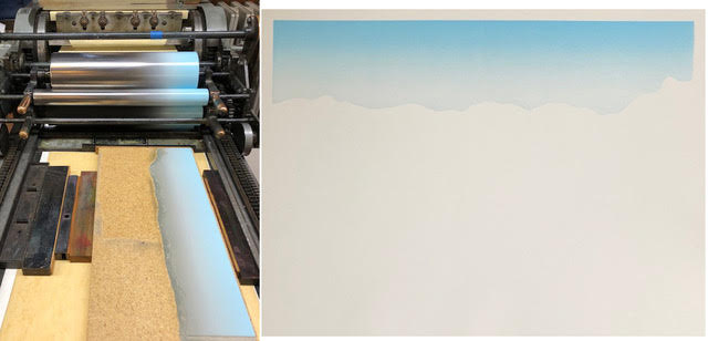
1: First I carve the shape for the sky, and print a gradient. You remove a doohickey from the metal roller so you can manually slide it back and forth as it spins, blending the ink just right, to create a sky blue that fades away in the right spot. Print 240 sheets.
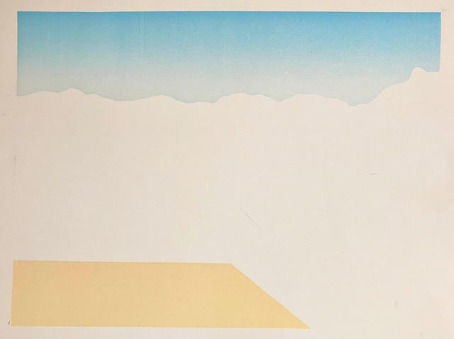
2: The second carving is a simple trapezoid, so basic I forget to photograph it. Print a blonde wood-colored dock.
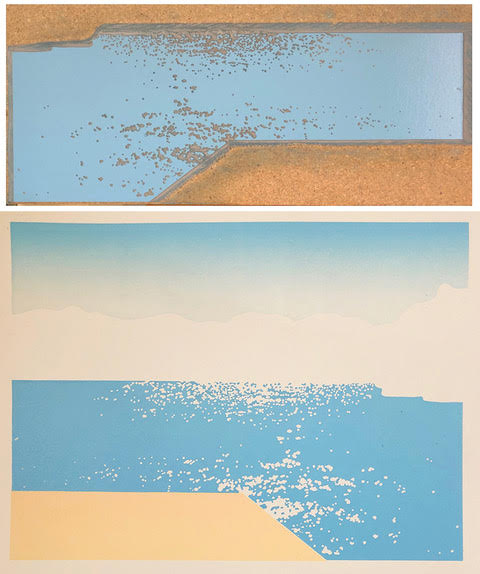
3: The third carving—light blue water with sparkles—gave me lots of practice cutting perfectly round tiny dots. Save this carving to be used again later.
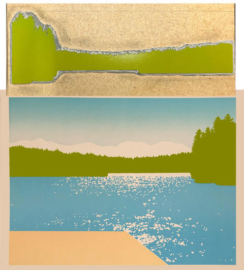
4: Next, a line of light green trees. Save this carving to be used again later.
5: Tan tree shadows on the dock, carved from that trapezoidal piece.
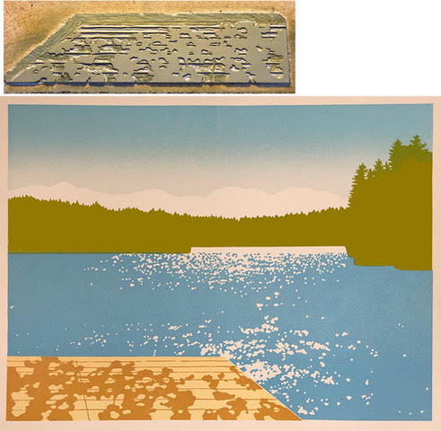
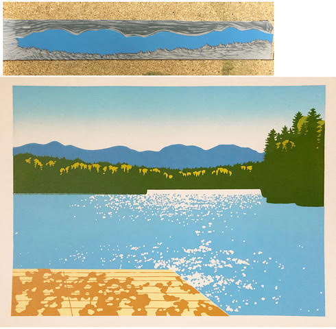
6: Re-using the tree carving, I cut away some rounded deciduous treetops, and printed darker green for the evergreens. Oops. Halfway through this printing, I realize I should’ve printed the mountains behind them first. Now I face a big challenge: to carve the mountains to perfectly fit up against the jagged treetop shapes, like jigsaw puzzle pieces. Thank you Victoria Brzustowicz for giving me a pep talk that I could do this!
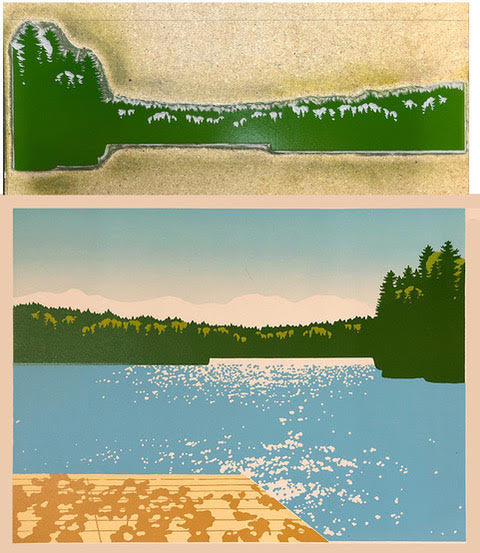
7: And amazingly, it works.
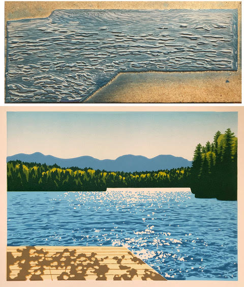
8: I take the carving that printed the water, draw wave shapes on it with a sharpie, and carve away the rest. It takes many hours to design, and at least 9 hours to carve. Mix up a blue that’s a shade or two darker than the first water color, and print. Well, that was worth the lost sleep.
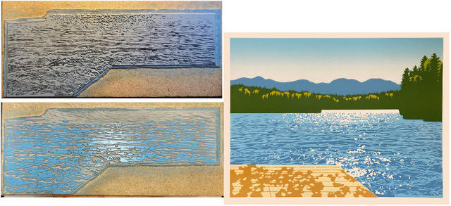
9: I took the dock shadows carving, cut away the edges of each shape, and printed dark brown. Now those shadows have soft tan edges.
10: Back to the tree carving again: cut away all the shapes that should stay medium green, and print darker green.
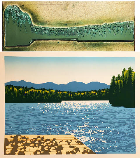
11: Back to the water carving again: cut away everything except the darker blue water shadows.
12: My friend Gaylon messages me: “It would be accurate to put a couple of loons on the water.” But would that be too cute? Well, I’ll try it; I can always cut them off. More questions: should the last color be dark blue or black? Should the dock shadows be hit with spots of black? Should some of the water shadows be darkened too? I carve all those things, and try printing dark blue. But it doesn’t show up against the dark green. Also those dock and water shadows are too dark. So right on the press, I cut away dock and water shapes. Added black to my blue ink, and printed. The loons might be a bit cute but they’ve grown on me, so they get to live.
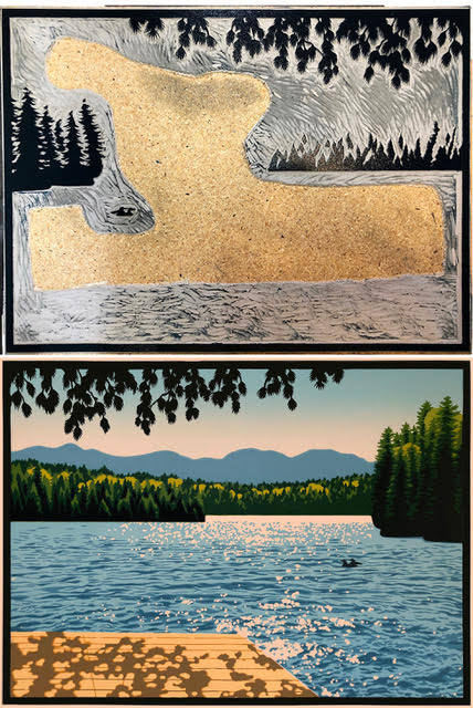
P.S. Gaylon just told me that when they were just dating, this is where he first took Bonnie camping, and discovered that she was a fearless wildlife and wilderness lover. That clinched it for him. That was 50 years ago, and they’ve been vacationing here with their two daughters ever since!

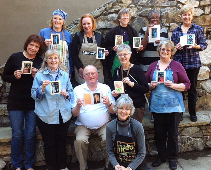
Thank you, Laura, for sharing your thoughts and process. It is absolutely beautiful and you do “water and highlights” so well.